
Adobe Express
How to make a Gantt chart in Adobe Express
A Gantt chart is a simple picture — one row per task, time along the top, a bar from each task's start to its end — and Adobe Express can draw it, just not from your dates. Here are the three ways to get one onto a page.
· Ryan Koning
What a Gantt chart actually needs
Three things, and only the third is hard. One row per task, with its name at the left. A date axis across the top, in days, weeks or months. And, for each task, a bar that begins where the task begins and ends where it ends — a bar whose position and length are measurements, not decisions. A chart where the bars were placed by eye is a drawing of a project, not a plan.
Adobe Express will give you the first two in a couple of minutes. There are three ways to go about the third.
Route one: start from a template
Adobe Express has a large set of timeline templates, including ones styled as Gantt charts, grouped as horizontal, vertical, roadmap and infographic. Open one, retype the task names, recolour the bars and you have something presentable in ten minutes.
What you do not have is a chart that knows your dates. The bars are artwork: their lengths were chosen to balance the page, so a task of three days and one of three weeks can easily end up the same width. That is fine for a slide that illustrates a plan and wrong for a page somebody will read dates off. If you take this route, either fix the lengths with the arithmetic further down, or leave the dates off the bars so the picture does not promise what it cannot keep.
Route two: the chart tool, and where it stops
Adobe Express has a chart tool — charts and grids, in the editor — and it is the first place most people look. It offers bar, line, pie and progress charts, and you fill each in as a list of labels with a value against each.
That is exactly one number per row, and a Gantt bar needs two: where it starts and where it ends. There is no chart type here that takes a pair, and no axis made of dates rather than categories. The spreadsheet trick — a stacked bar whose first, invisible series is the offset — needs a stacked bar to stand on, and that is not among the types on offer either.
So the chart tool is the right answer for the budget beside your plan, and not for the plan itself.
Route three: draw it, with the arithmetic done first
This route needs nothing but Adobe Express, and the only part that matters is doing the sums before you draw.
- Fix the window. Take the earliest start and the latest end in your list, and round them out to whole weeks. Count the days between them; call that the span.
- Draw the frame as one rectangle, as wide as you want the chart to be, and work out one number: the frame's width divided by the span. That is what a single day is worth in width.
- Put the axis in. A thin vertical line duplicated at every seven days, with a date label above each one. Duplicate rather than redraw, and align the copies, so the spacing stays exact.
- Then each task is one rectangle. Its distance from the left edge of the frame is the days between the window's start and the task's start, times the number from step two. Its width is the task's length in days, times the same number.
- Milestones — a date with no duration — are a small square turned forty-five degrees, centred on the same calculation.
- A today marker is one more vertical line, by the same arithmetic — and the first thing to be wrong next week.
It works, it is accurate, and it is yours to redo. Every date that moves is that calculation again for the bar, and usually for the window, the axis and every bar after it.
The add-on I built for the arithmetic
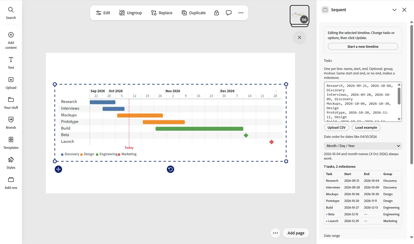
I wanted the third route without the sums, so I built Sequent, an add-on for Adobe Express. You paste your rows — a name, a start and an end per line, with an optional group and colour — or upload a CSV, and it draws the chart on the page: task bars, milestone diamonds, the date axis, a legend and a today marker, scaled from the dates you gave it.
What it inserts is ordinary shapes and text, grouped as one object, so everything after that is normal Adobe Express work: recolour a bar, retype a label, move the whole thing. When a date changes, select the group, edit the rows and update — it is redrawn in the same place, at the size you had scaled it to. It is free, needs no account and makes no network requests: the rows stay in your document and your browser.
It is with Adobe's reviewers at the time of writing.
Whichever route: three things that make it readable
- Keep one page to about fifteen rows. Sixty tasks on a page is a texture, not a chart; split it by phase or by team.
- Colour by group rather than by task, and print the legend. Twelve colours mean nothing; four mean something.
- Put the task names in a column at the left, aligned to the bars, rather than on the bars — a name on a bar is unreadable the moment the bar is short.
Adobe Express's chart types and templates were checked in October 2026 against Adobe's own pages. Omni is not affiliated with Adobe. Adobe and Adobe Express are trademarks of Adobe.